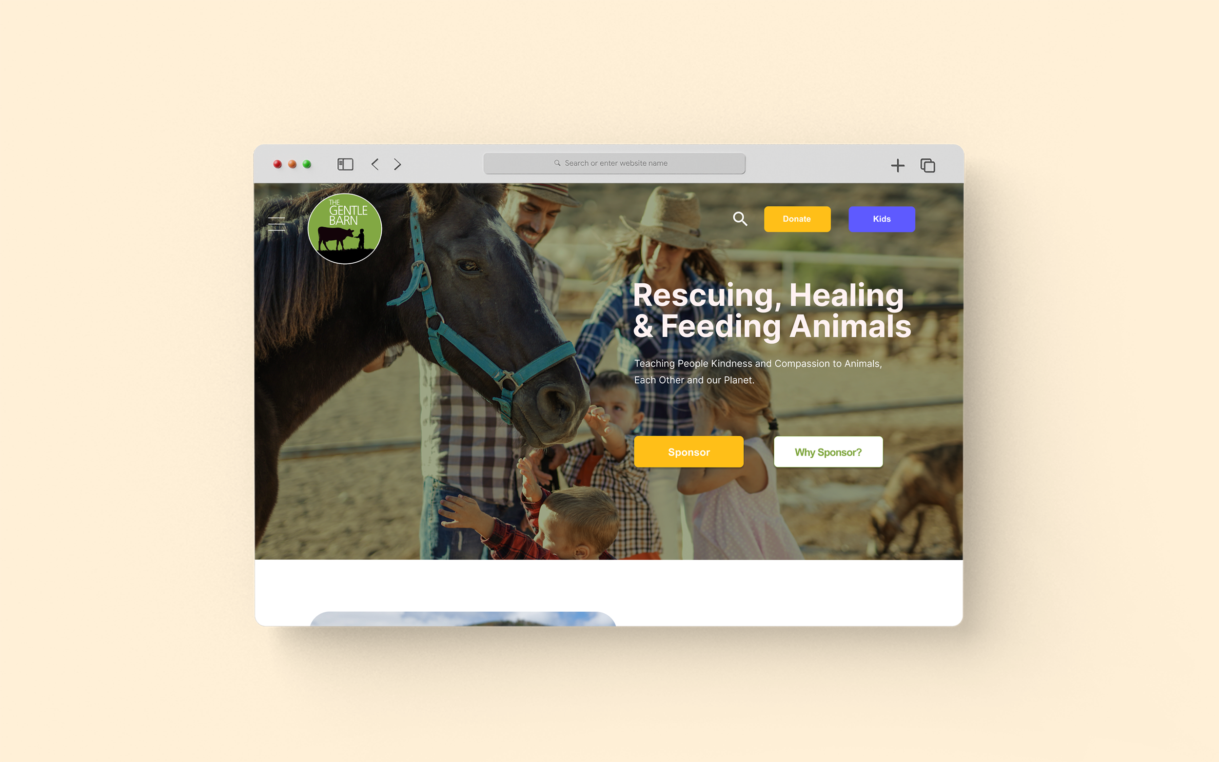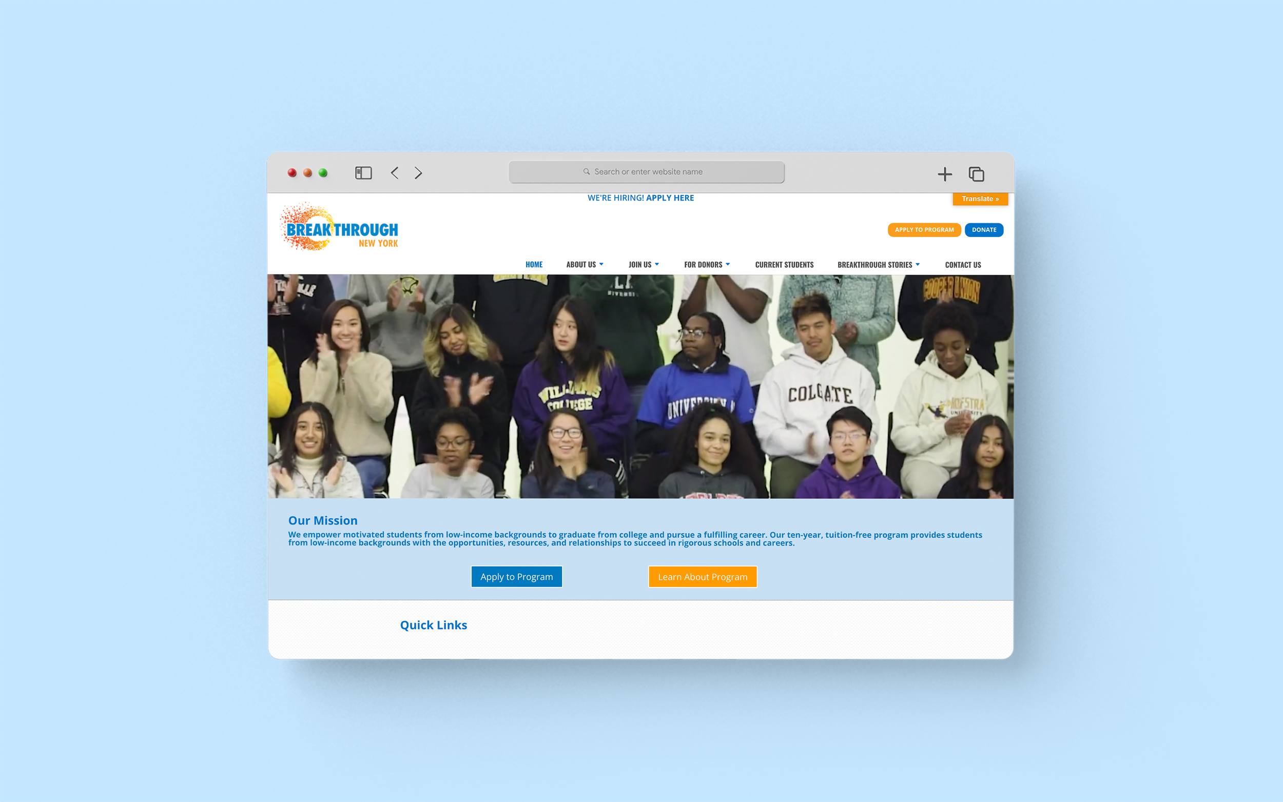
Breakthrough NewYork (BTNY)
Background
Breakthrough New York, is a local, non-profit organization and community that aims to improve educational opportunities for students of low-income backgrounds. This project aims to redesign the Breakthrough NewYork website by analyzing and evaluating the website's usability problems.
Project Goal
Have a solid understanding of the organization’s purpose and operations, and identify any needs and challenges that it faces.
My role : UX designer and UX researcher
I played a core part in leading moderated usability testing and data analysis, using heuristic evaluation method and rainbow spreadsheet. I set a client meetings to break down users and the organization's goals. I identified areas for improvement that align with the organization’s and user's purpose.
The Impact
(1) After proposing solutions, direct task’s success rate increases 81.82%.
(2) Gained the client’s interests and selected proposals
Team
Chloe Jang
Daisy Garcia
Marc Molta
Monica Gopi Krishna
Vivian Peng
Process
Preparing Test
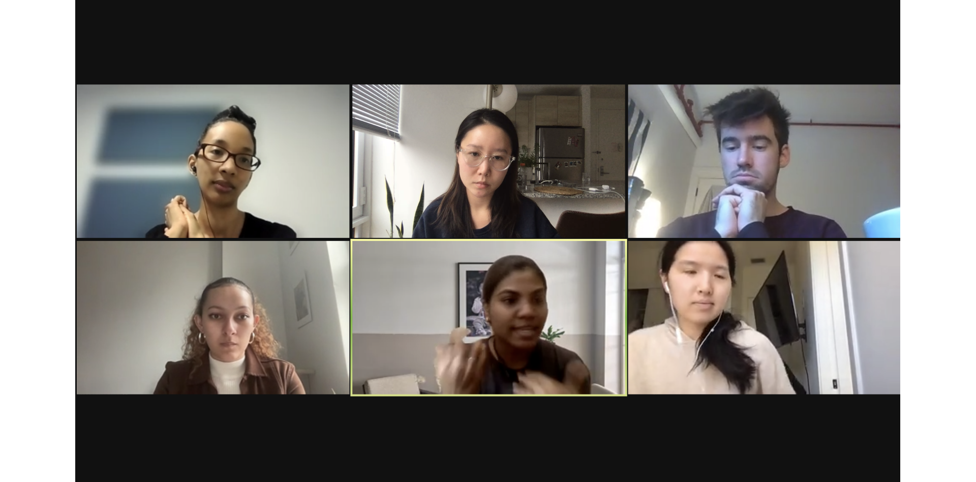
CLIENT MEETING
Before conducting the usability test, our team had a meeting with an external relations manager in Breakthrough NewYork to gather information about the organization’s objectives and hopes for the website.
FROM THE CLIENT MEETING, WE FOUND
Target Users
Prospective students and parents
People looking for career and Volunteer Opportunities
Educational Institution
Donators
Needs and Challenge
Need for clear way-findings for different audiences
Improve discoverability as currently, people spend very little time on the website
Two main use cases- someone to participate in the program and hiring to work with us
PROJECT GOAL
After the client meeting, we were able to gather information about the organization’s goal and hopes for the website.
Have a solid understanding of the organization’s purpose and operations, and identify any needs and challenges that it faces.
SUCCESS METRICS
After our team and client setting the project goal, we created success metrics to measure the success
RECRUITING PARTICIPANTS
Based on the client meeting, our team proposed a user group for user testing.
User type : Currently students who are eager to teach in the future or had volunteering experience
We also organized a pre-questionnaire to learn more about the participants’ professions, past experience of voluntary teaching, or a willingness to teach.
WE ACHIEVED THIS RESULTS FROM THE SURVEY
Moderated user testing
IMPRESSION AND DIRECT TASKS
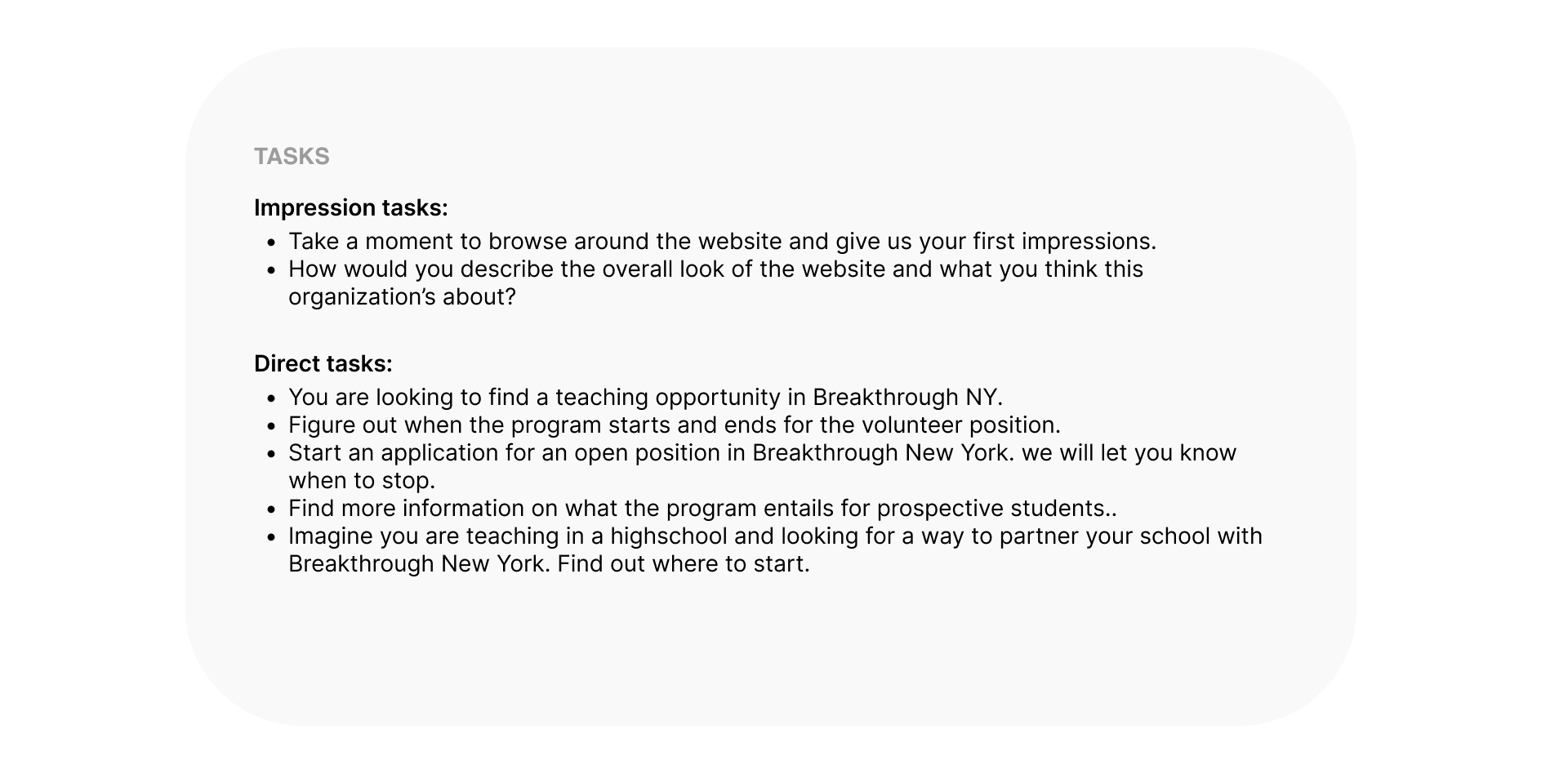
We gathered eleven participants including pilot test. Participants were asked series impression tasks and direct tasks to examine whether they have an ability to complete the tasks and understand the organization's purpose and operation
KEY TAKEAWAYS
What our team better understood after conducting our moderated user tests
Collecting Data
AFFINITY DIAGRAM
After conducting the usability testings, we needed to narrow them down to form actionable solutions. Therefore, we then analyzed data we gathered to form a strategy through Affinity Mapping. We analyzed through three metrics
(1) Task Success Rate
(2) Time to Complete The Tasks
(3) Behavioral
WHAT WE FOUND
HOW DO WE HELP
To address pain-points, we suggested three actionable recommendations with respect to the findings
Problems and Recommendations
SUMMARY OF PROBLEMS AND RECOMMENDATIONS
Overall, these issues collectively identify usability issues in terms of efficient usage, content management and site navigation (Site Map) with respect to their target audience. To assist Breakthrough New York's mission to serve its users, we highlight three actionable recommendations to improve the new and intuitive user flow with redefined Sitemap, prioritize content based on usage and ease of access to the information.
PROBLEM 1
Difficult to identify its purpose and unclear categorization for each section.
(A) Users were unable to identify the mission statement.
(B) Users took time to navigate through the homepage as there is’t clear categorization for each section
SOLUTION 1
Redesigning the Homepage by prioritizing the content and features to focus the target audience.
(C) Add “Apply to our Program” CTA close to the mission statement.
(D) Add section titles for each section helps reduce the cognitive load.
PROBLEM 2
Inefficient sitemap
(A), (B) On the site map, “current opportunities”, where the website lists all job openings irrespective of the chosen persona hinders the efficiency of use.
(C), (D) Job listings which are repeated and there’s no signifiers.
SOLUTION 2
Redefining the “Join Us” section to improve employment navigation and provide users with an ease of access to information.
(E) Restructuring BTNY Site map and defining “Join Us”
(F) Turning pages (Volunteers, Teaching staff & mentors) into sections
(G) Prioritizing Job links to the “Current opportunities” page with respect to the selected position
(H) Maintaining visual consistency
(J) Auto-populating the Job type filter.
PROBLEM 3
A lack of clarity on on partnership
(A),(B) Broken link and users expect the much needed contact information
(C) Users ignored information in the blue strips as they are buried in between scrolls.
SOLUTION 3
Redesigning the “School Partners” page by updating the content to cater towards possible partners aka institutions, as much as prospective students.
(E) Creating a "Partner Institutions" section
(F) Replacing buttons linked with Email
(G) Improving legibility of the content in the blue section
(H) Elaborate outline what partnership through FAQs
(J) Introducing sections to eliminate long scrolling
STYLE GUIDE
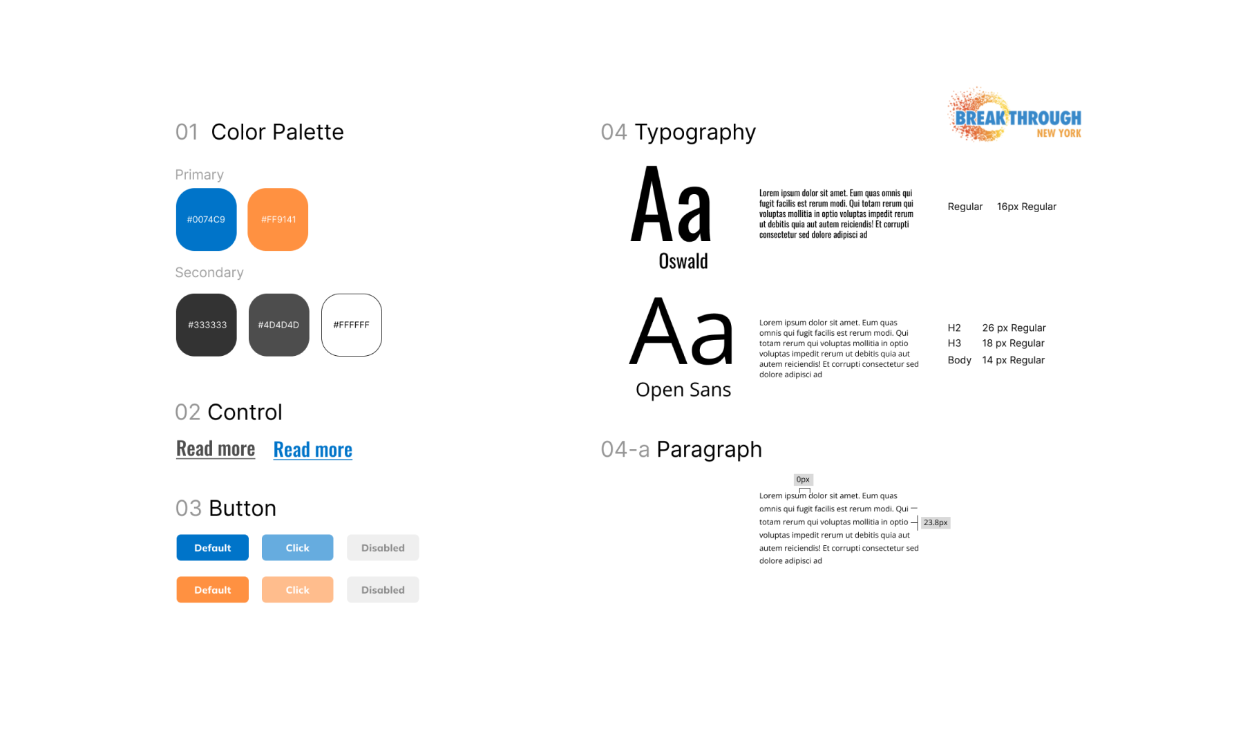
We also found The Breakthrough New York lacked a specific style guide leading to inconsistent design on current website. Thus, I proposed a style guideline considering WCAG and ADA guideline.
Future Scope
CLIENT MEETING
Our client was impressed!👏
My team and I presented our findings to the client and she was very pleased with our work.
In the result, BTNY refined website based on our team suggestions for example, BTNY added applying program CTA on the homepage.
Our client also asked us about our personal experiences with the current website. I mentioned how I appreciate having the search suggestions list in the new interface, as this feature is missing from the current website. Our client was very glad to hear this feedback, and she hopes to implement the search suggestions feature next summer as well.
REFLECTION
Conducting moderating test was trickier than I thought because It provided limited qualitative feedback since users didn’t often think out loud without a moderator and some of users had technical issues and gave up. I believe specify tasks could be a way to reduce ambiguity and moderator intervention during the test.
THE IMPACT