Radical X
Background
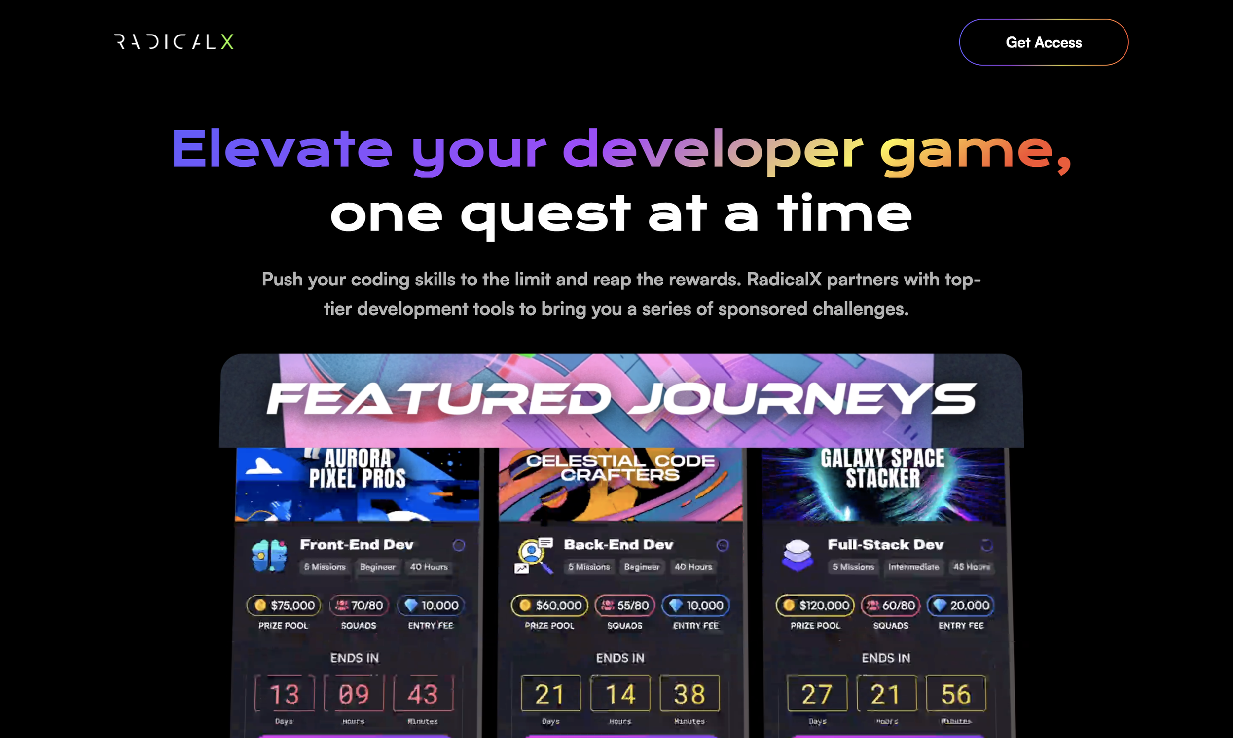
Radical X is building an immersive digital world for next-gen developers, where they are guided by an AI Manager and work in teams at a fantasy company to earn money by competing in sponsored coding contests that simulate day-in-the-life scenarios.
Objective
The aim of this project is to update the current platform design system on Figma. The design team is tasked with auditing the existing components, updating and adding new components, and ensuring the system's consistency and relevance.
The Result
Documentation - Documented guidelines on how and when to use design elements
Brand guideline - Developed a brand guideline including logo, tone and voice, writing style and more
Client
Design team need to maintain clear communication with engineer team throughout this project. We start off audit existing components. We review each component in the design system for accuracy, usability, and relevance. Throughout the feedback sessions, our team found current design system has inconsistencies and lack of accessibility.
By creating an updated centralized design system, we aimed to:
Align our teams by giving them a more structured and guided way to build products.
The design system effectively promotes design consistency across different parts of the platform
Speed up our design and development process: with a ready-made library and patterns teams can create and test layouts much faster.
The Problem? Too Many Variants
When design team audit the current design system, we discovered that only were the assets widely different, there were so many variants of buttons, badges, and other components.
Inconsistent padding & color shades - Multiple padding sizes and shades of various colors used for buttons and components
Lack of accessibility - Low legibility. There are many components with white text on the light color doesn’t pass WCAG guidelines.
Lack of descriptions - There isn’t clear description for each components. Clear usage descriptions help designers and developers communicate efficienctly
Color
In Radical X design system, every color has an assigned role, which hold a specific meaning based on how they function within the interface. The primary color and the secondary color represent the Radical X. After auditing the design system, we discovered color ration doesn’t pass wcag guideline. We update the color scheme according to the guideline and update additional shades of the base color to cater to varied use cases such as dark mode.
Typography
Radical X has been using Satoshi as a primary typeface. Existing typography doesn’t define size for headers and text context. Our team define how these sizes work across different device and viewport dimensions.
Buttons and Input Fields
Buttons and Input fields are interactive components that allow users to take an action. It’s important buttons offers a specific purpose. However, in current design system, enable state, or the active/display state hasn’t been developed. Thus, we decide to design several types of buttons and input fields to inform the states. When we re-design the input fields, we make sure that title of the field doesn’t go away when selected, and that there are color indicators for errors.
Next steps?
As the design system grows, I hope to create more standardized and consistent assets that can be reused in many ways. There is still room for improvement such as comprehensive button states (enable, hovered, focused, pressed, dragged, and disabled). Also, add clear guidance and name for each assets to better communicate with developers.
I’d love to collect feedback on how the design system can be improved to better serve the purposes of the design team.