THE GENTLE BARN
Redesigning The Gentle Barn's website to guide users to to easily donate and involve with events
My role
I played a core part in designing the visual system, wireframe, and conducted user interviews. Based on the the research, I created storyboard and user journey map to highlights a big picture idea about a new feature for The Gentle Barn. Every team member was responsible to develop user scenarios and content.
Team
Chloe Jang
Anjali Karthik Rao
Flita Fernandes
Kirtika Arora
Duration
2022.04 - 05
Tools
Sketch
Miro
Optimal Workshop
PROBLEM SPACE
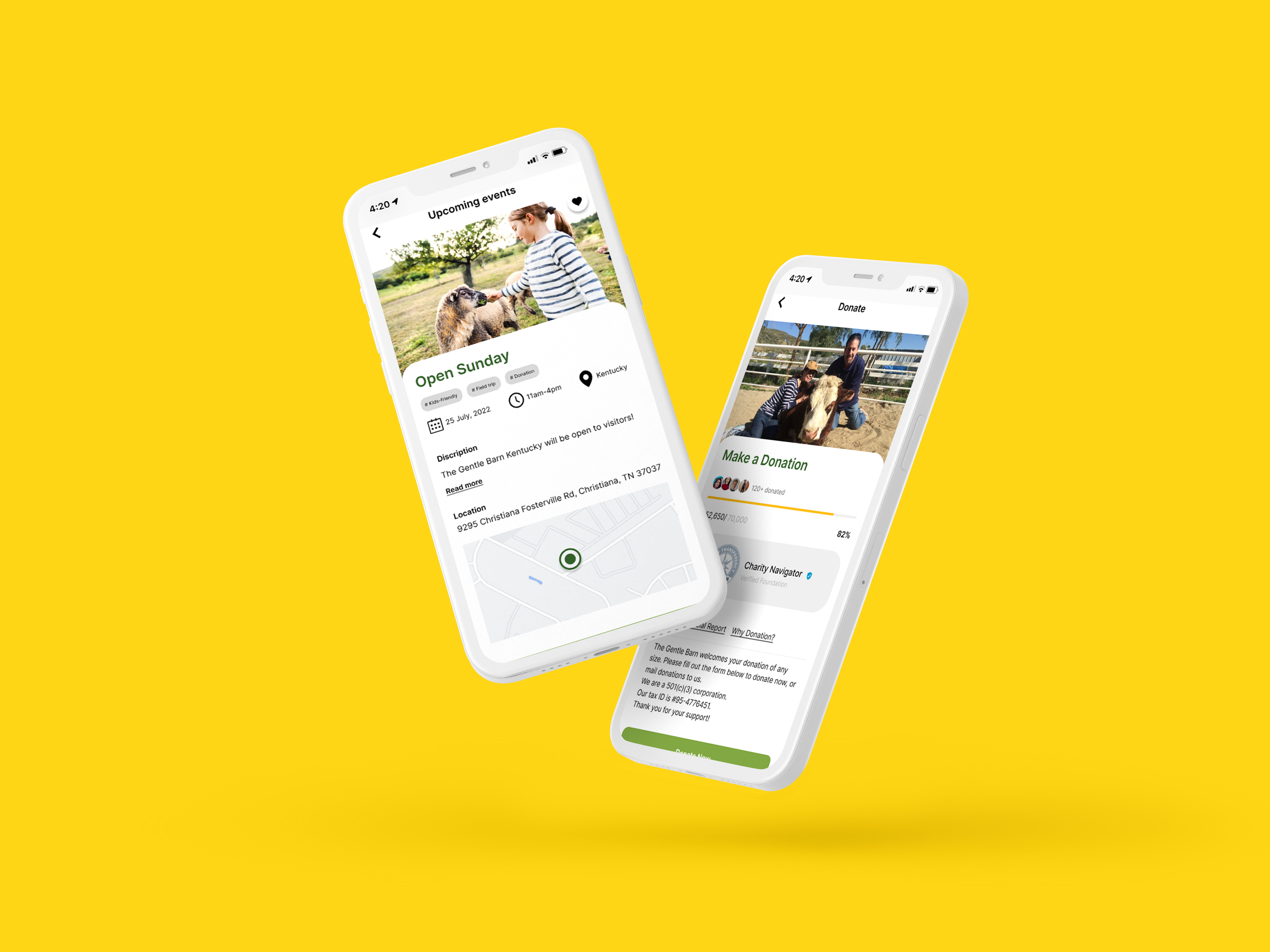
The Gentle Barn hasn’t clear explanation about donation and support. There are outdated contents and has become less effective at communicating its services to its target audience.
SOLUTION
By building kids-friendly website, guide users to easily with The Gentle Barn events with kids. Adding Why Donation and Support helps them to understand how the donation contributes to animal welfare .
PROCESS
Primarily research - Secondary Research - User Research - Revised sitemap - Tree testing - Ideation - Iteration - Final Design
ABOUT THE GENTLE BARN
The Gentle Barn.org
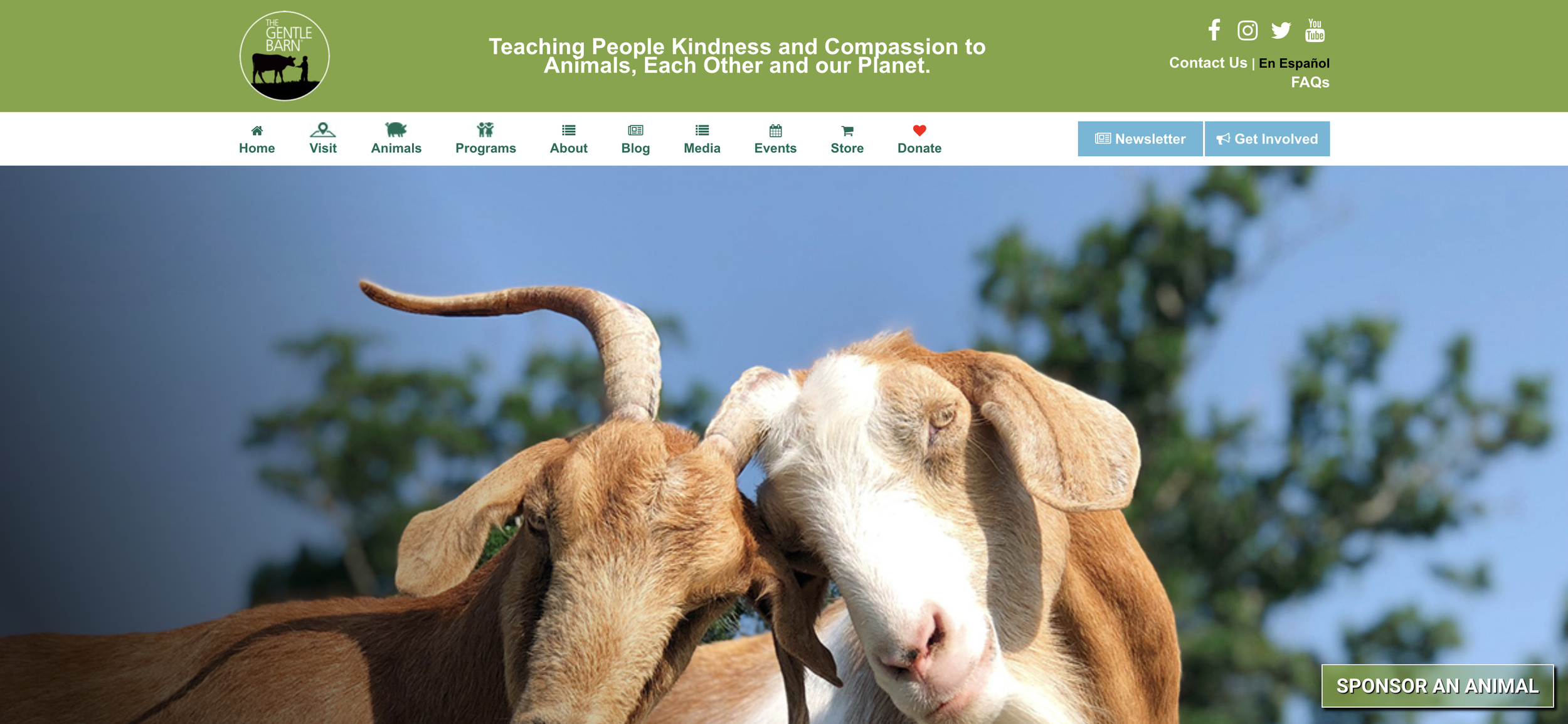
The Gentle Barn is an American nonprofit 501 animal sanctuary organization located in Santa Clarita, California. However, the current website is outdated and has become less effective at communicating its services to its target audience. For the research portion for an adequate redesign of the Gentle Barn website, our team conducted user interview and current usability testing.
WHY THE GENTLE BARN??
First of all, we were finding Nonprofits have a mission outside of just making money, and it’s wonderful to work for a cause we believe in. Current The Gentle Barn’s website is outdated and has become less effective at communicating its services to its target audience. We strongly believed that even basic process changes — like redesigning Donation forms or updating Animal pages could have great effects! Gentle Barn’s mission “ Teaching People Kindness and Compassion to Animals, Each Other and our Planet.” was compelling to us and we wanted to help them to achieve the mission.
CURRENT PAIN-POINTS
Inconsistent branding across The Gentle Barn website
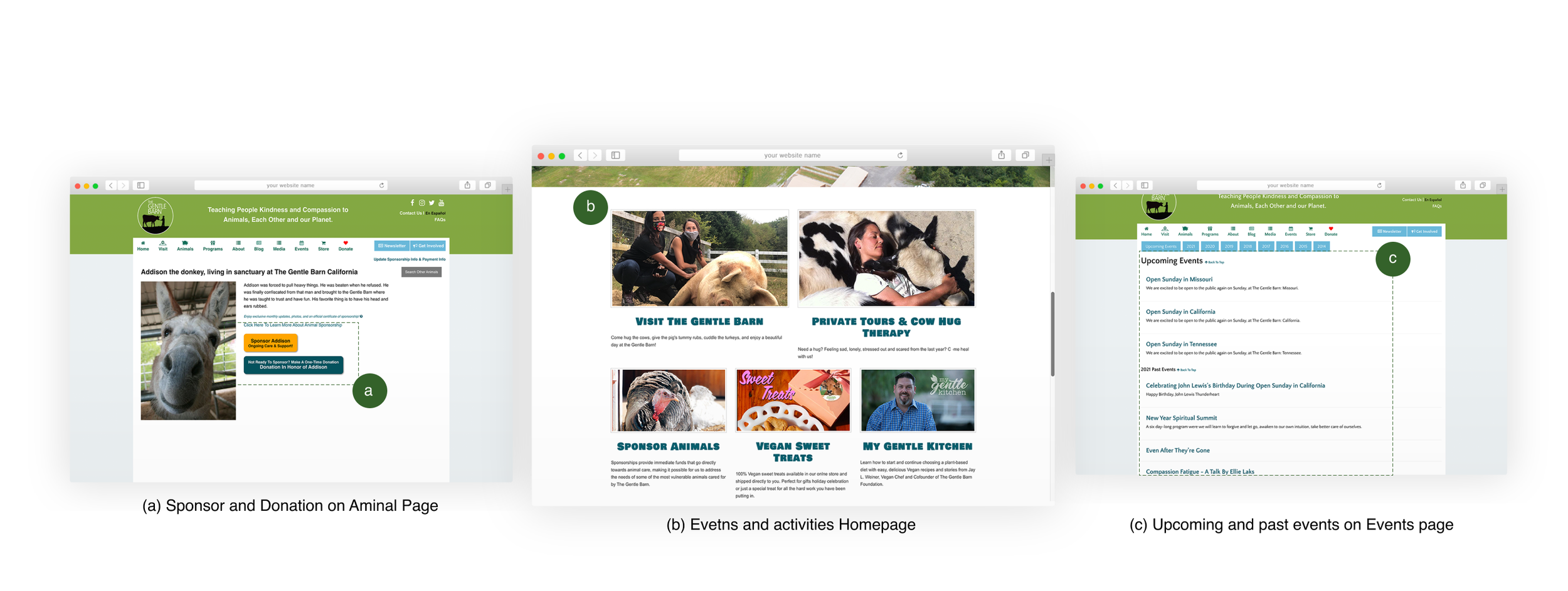
Throughout usability testing, we found that users could not identify upcoming events and other content due to unorganized categories—outdated information on the website that result in untrustworthiness toward The Gentle Barn. Also, they were confused by vague words between sponsor and donation. There’s no clear explanation of the sponsor process and how users can involved with it.
Tasks:
(1) Find what The Gentle Barn does
(2) Reserve most recent animal events in CA location
(3) Find Financial report and Tax ID
COMPETITIVE ANALYSIS
Next, our team analyzed three most popular non-profit animal organizations. Throughout the research, we found out some must-have design elements to find ways The Gentle Barn site can stand apart.
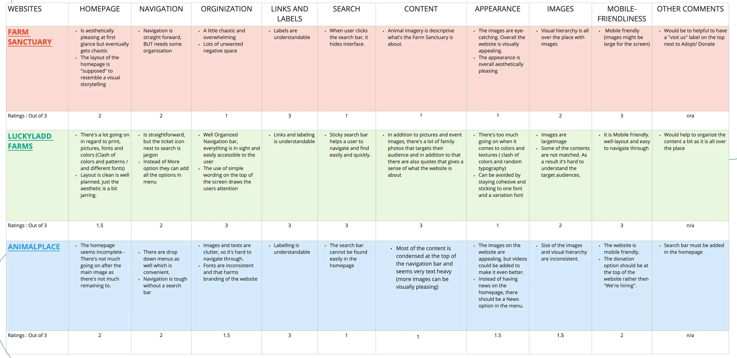
Must-avoid elements
Big amount of text contents
low-resolution imagery
Too much donation asking
Must-have elements
Noticeable “Donation” CTA
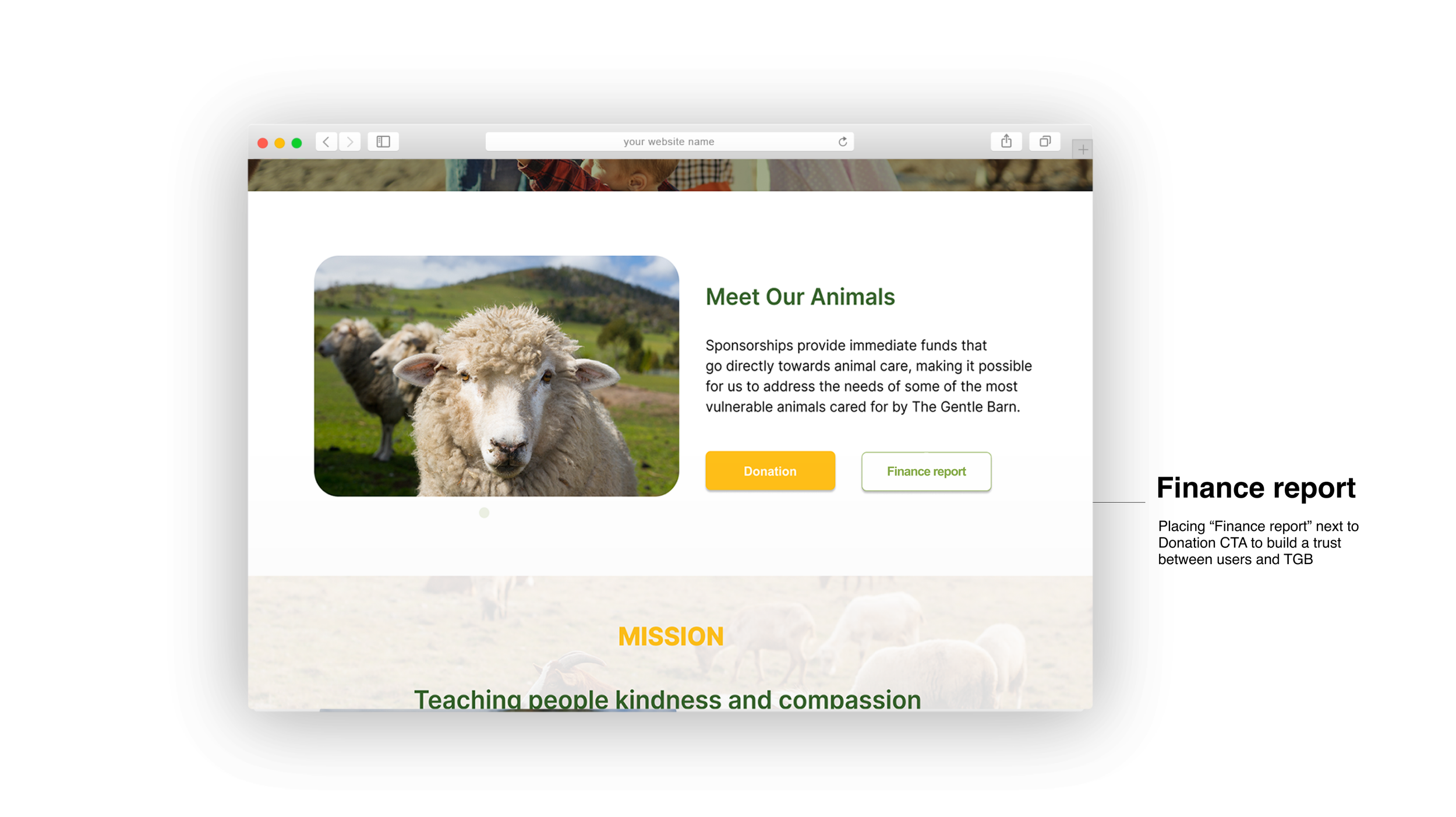
Financial report and verified mark inside Donation page
Timely update on real impacts resulting from their donation.
USER TYPE
We selected Y and X generation who are familiar with animal sanctuary and have children as a target group. Then we divided the user target group more specifically with their characteristics.
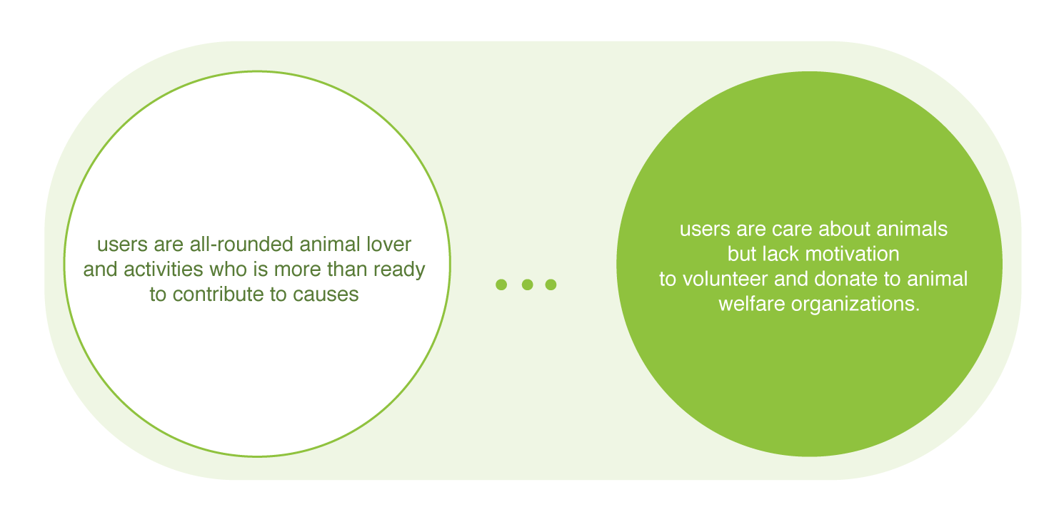
(1) Users who are actively support and participate animal activities.
(2) Users who care about animal, but lack motivation to support animal welfare organizations.
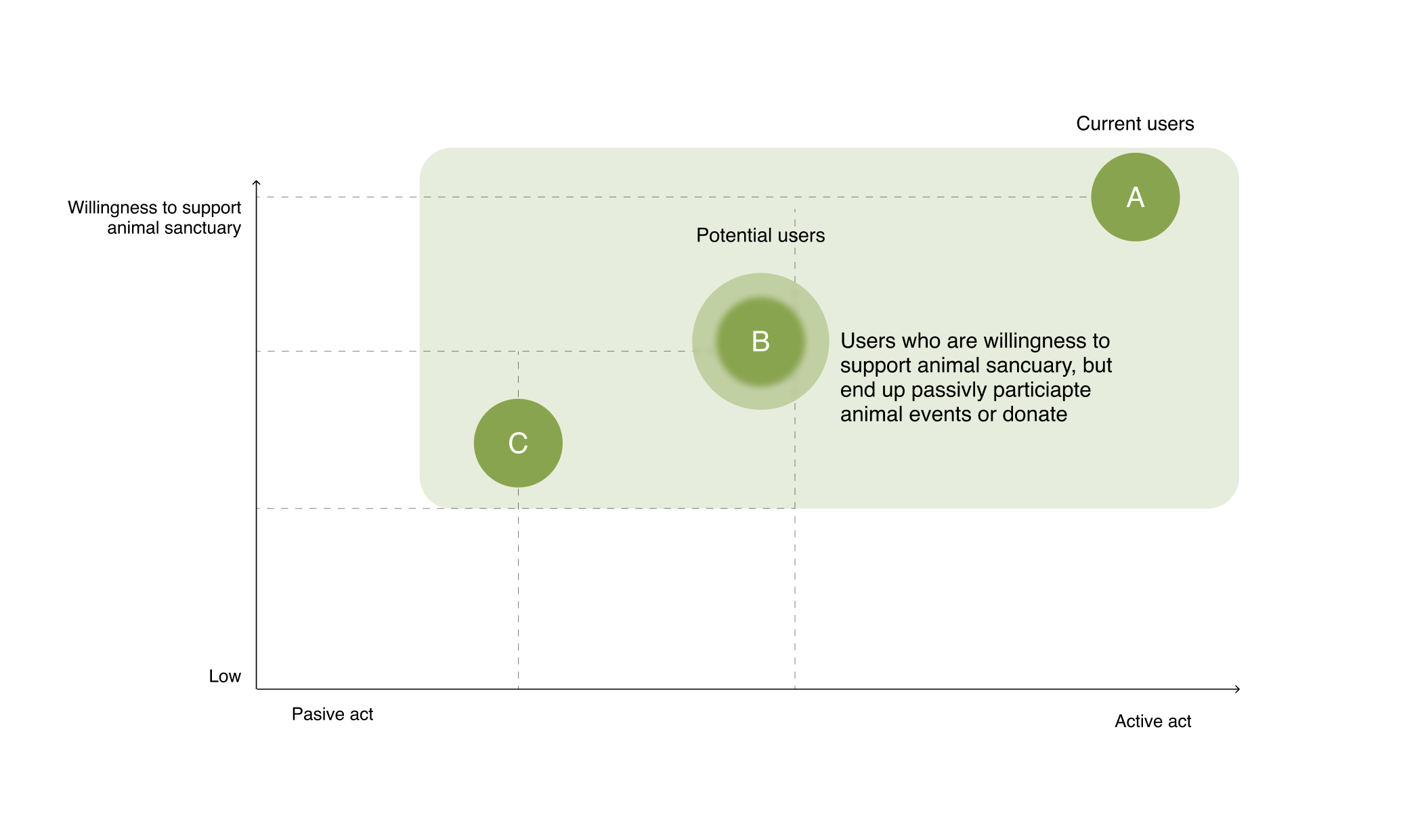
We target B user group who are desire to support animal welfare organizations, but lack motivation to volunteer and donate to them.
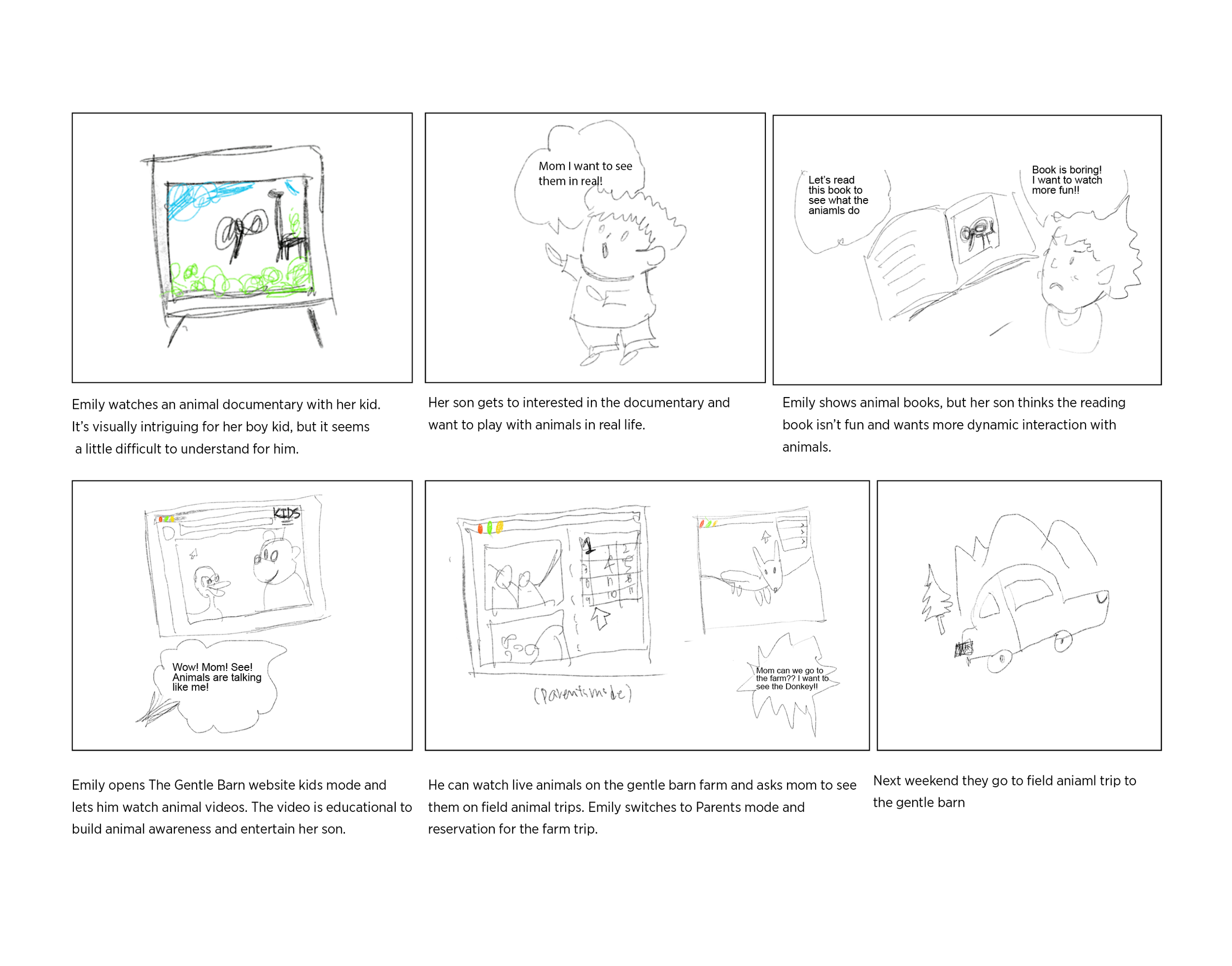
Concept story board CONCEPT STORY BOARD
How might we re-build kids friendly website?
We found that TGB events are kid-friendly. And, target users are highly interested to participate in animal events with their kids. This lead us to create a concept storyboard to highlights a big picture idea about a new feature that can help to achieve the organization and users goal.
USER JOURNEY MAP
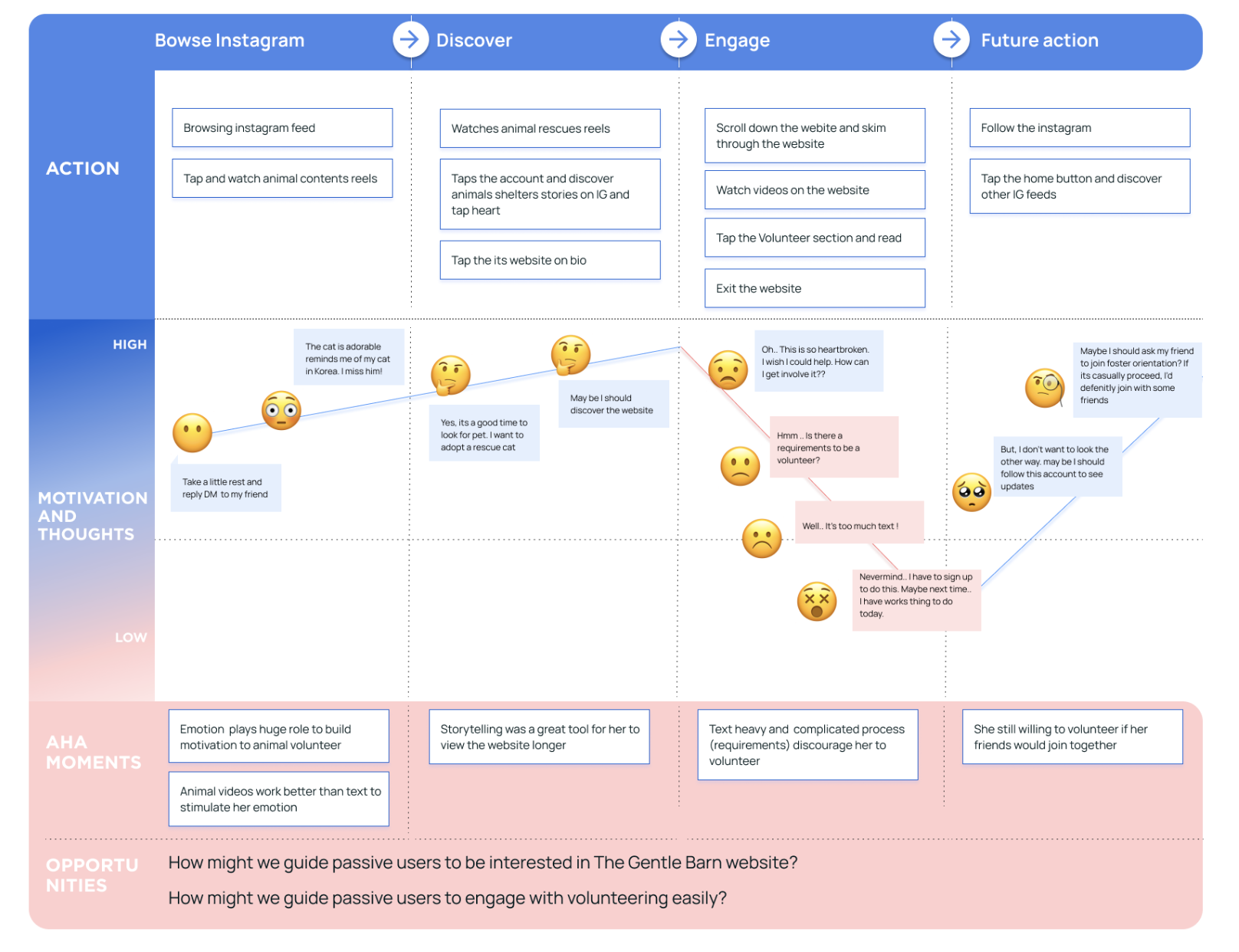
USER JOURNEY MAPWhat are users’ expectations and motivations to donate?
We had to listen to user stories about animal donation through various platforms. We could understood what are their expectations or motivations to animal donation. We found efficient storytelling is likely to appeal to user’s empathetic side and compel them to get involved.
KEY FINDINGS
PROJECT DIRECTION
Here are the primary & secondary research results that informed our new project directions
(1) Inform users where donations go
If there’s no clear description of how those donations will be used, users are less likely to get involved
(2) Story telling
Show the impact TGB has made, and encourage users to get involved and contribute by story telling (imagery or video)
(3) Kids friendly
Target user group is likely to help animals in need and be a role model for their children.
How might we guide users to easily donate and involve with TGB’s events?
CARD SORTING AND TREE TESTING
Understand how users think and behave conceptualize, group on the revised Information Architecture
Task 4: You want to go to weekend Field trips with your kids. Where would you find this?
Task 5: You want to know The Gentle Barn's donation report. Where would you find this?
Task 1: Where would you find what's The Gentle Barn does.
Task 2: You want to support The Gentle Barn. Where would you find to support them?
Task 3: You want to find animal materials for kids. Where would you find this?
The current version of the website had up to 15 clickable buttons in the navigation and the header combined, which we narrowed down to smaller categories for my participant to sort out the site inventory.
We conducted Card Sorting in the Miro board and Tree testing in the Optimal Workshop to revise Information Architecture for The Gentle Barn website. As a result, we found the three types of critical issues in the existing information architecture.
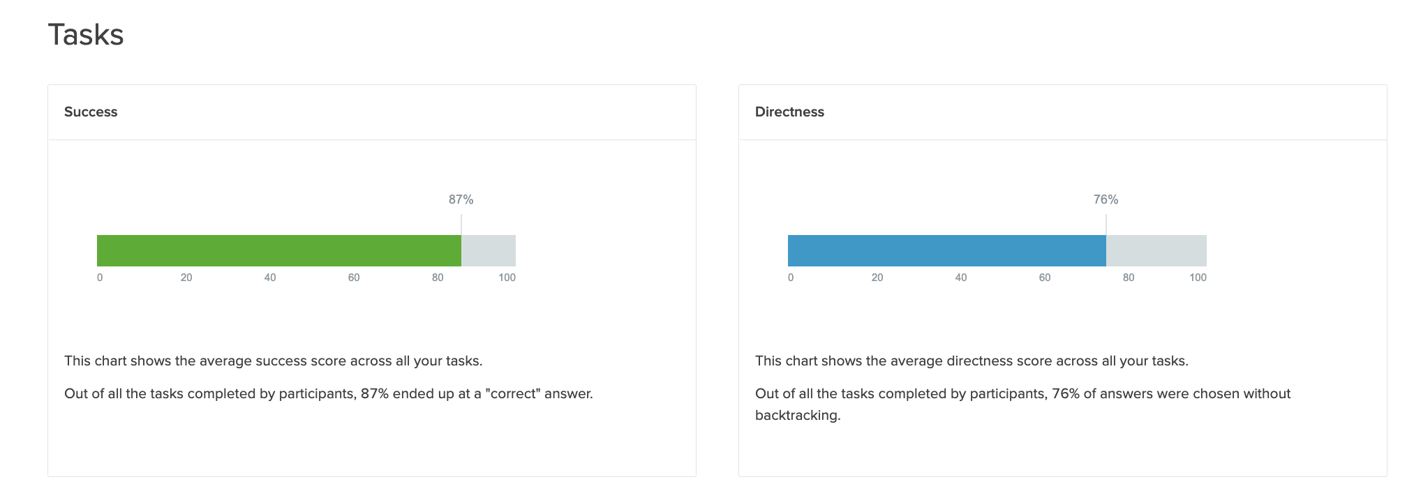
Tree Testing resultWe found out of all the tasks completed by participants, 87% ended up at a "Correct” answer and Out of all tasks completed by participants, 76% of answers were chosen without backtracking.
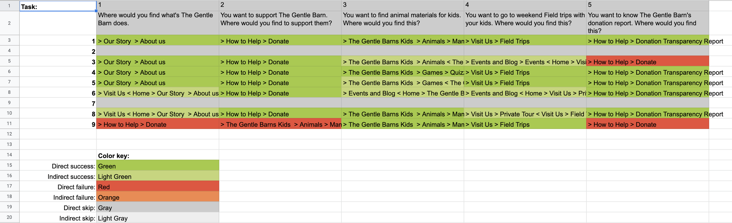
PathWe found Task 5; : You want to know The Gentle Barn's donation report. Where would you find this? has the highest direct failure rate (29%) Users assume financial report will be in Donate page.
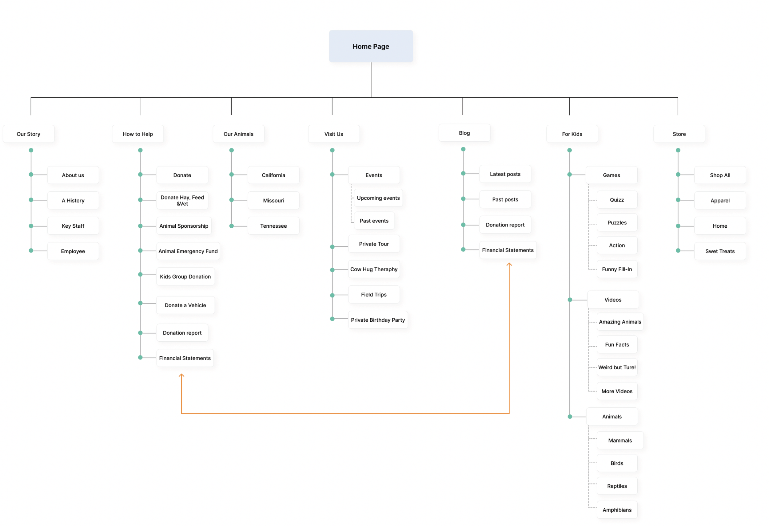
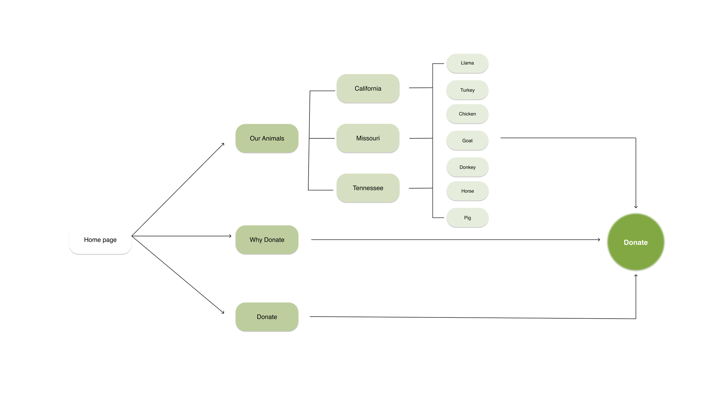
Based on the tree testing result, we revise site maps. The new information architecture introduces simplified top-level navigation and rearrangement of ambiguous items such as "Financial Statements" to ensure more efficient ways to complete tasks. TGB primarily relies on donations from both individual and corporate sponsors to sustain its operation thus, we also rearrange multiple Donate CTAs on pages exposed to users.
PAPER PROTOTYPE
Task 1: You find out that your 5 years boy is interested in horses. Were would you find animal materials for your kids?
Task 2: After reading about The gentle barn, the organization seems to positively impact society. So you decide to support them. Where would you find out about how to support them?
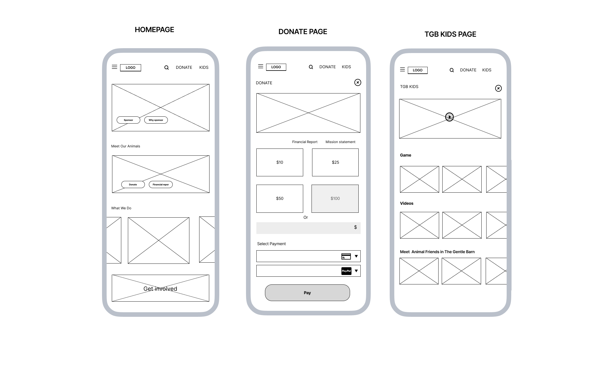
Next, we conducted a paper prototype with revised wireframe for 4participants to find usability errors and determine whether they comprehended the concept of a new page (Kids page) and donation/sponsor process on the website and mobile version.
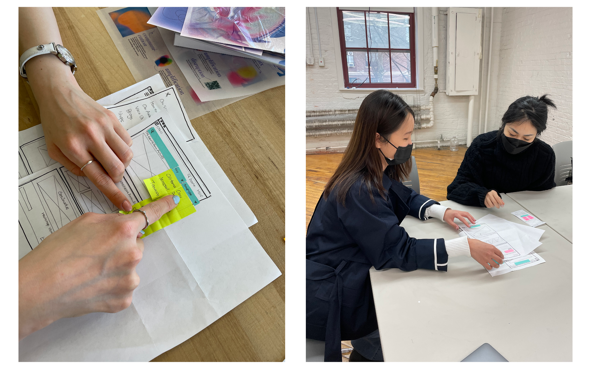
PAPER PROTOTYPE FINDINGS
PROBLEMS
They got stuck when choosing the amount of money to donate on the donation page.
On Our animal page, it took time for them to find horses in California because of overload of portions on the page.
They were confused about the difference between Sponsor animals and Donation.
OPPORTUNITIES
Highlight a default donation amount and add option of inputting a custom amount.
Add filter search bar for users to find desired contents quickly
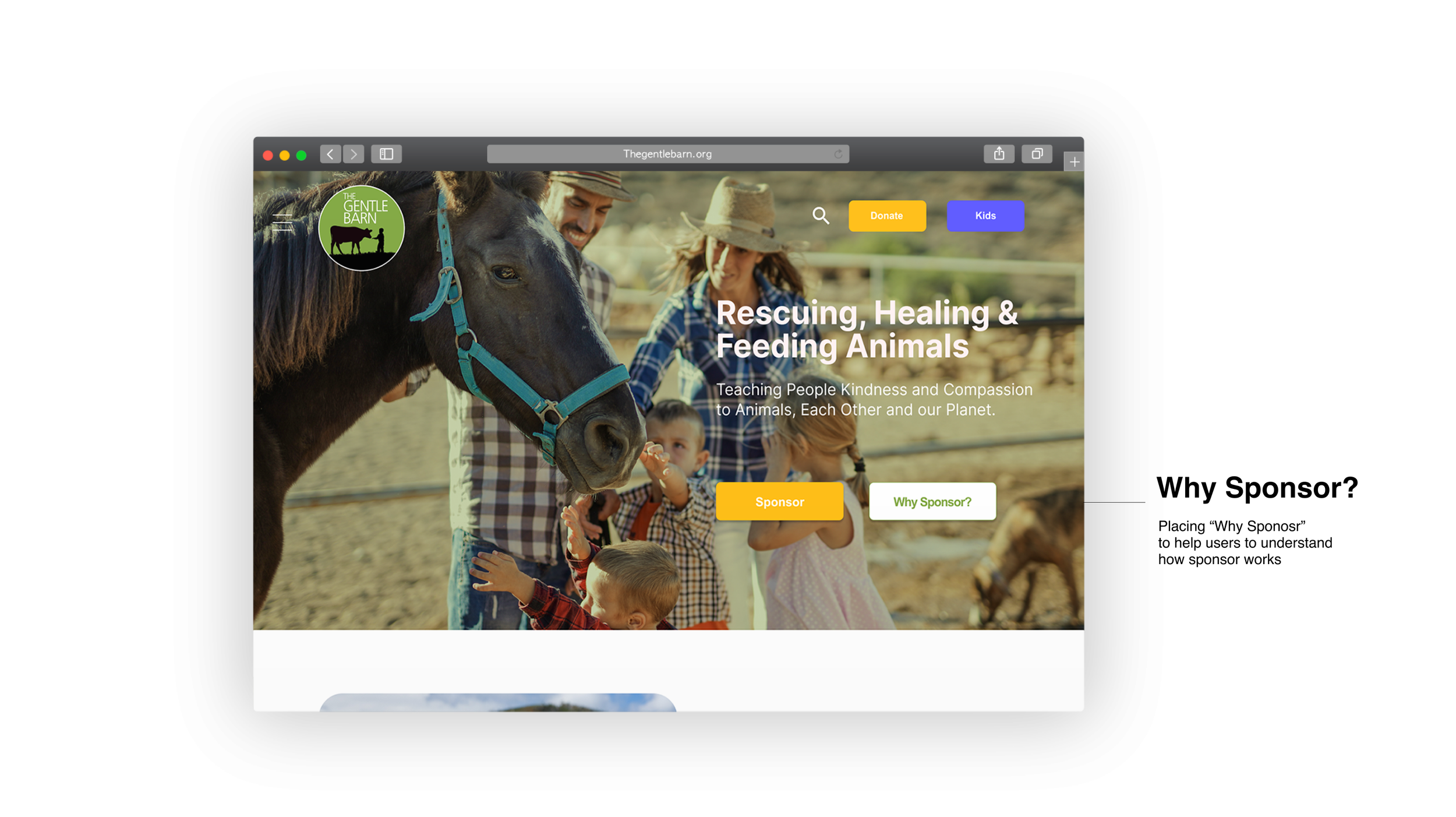
Add Why Sponsor CTA next by sponsor Animal to help users to understand how the sponsor works.
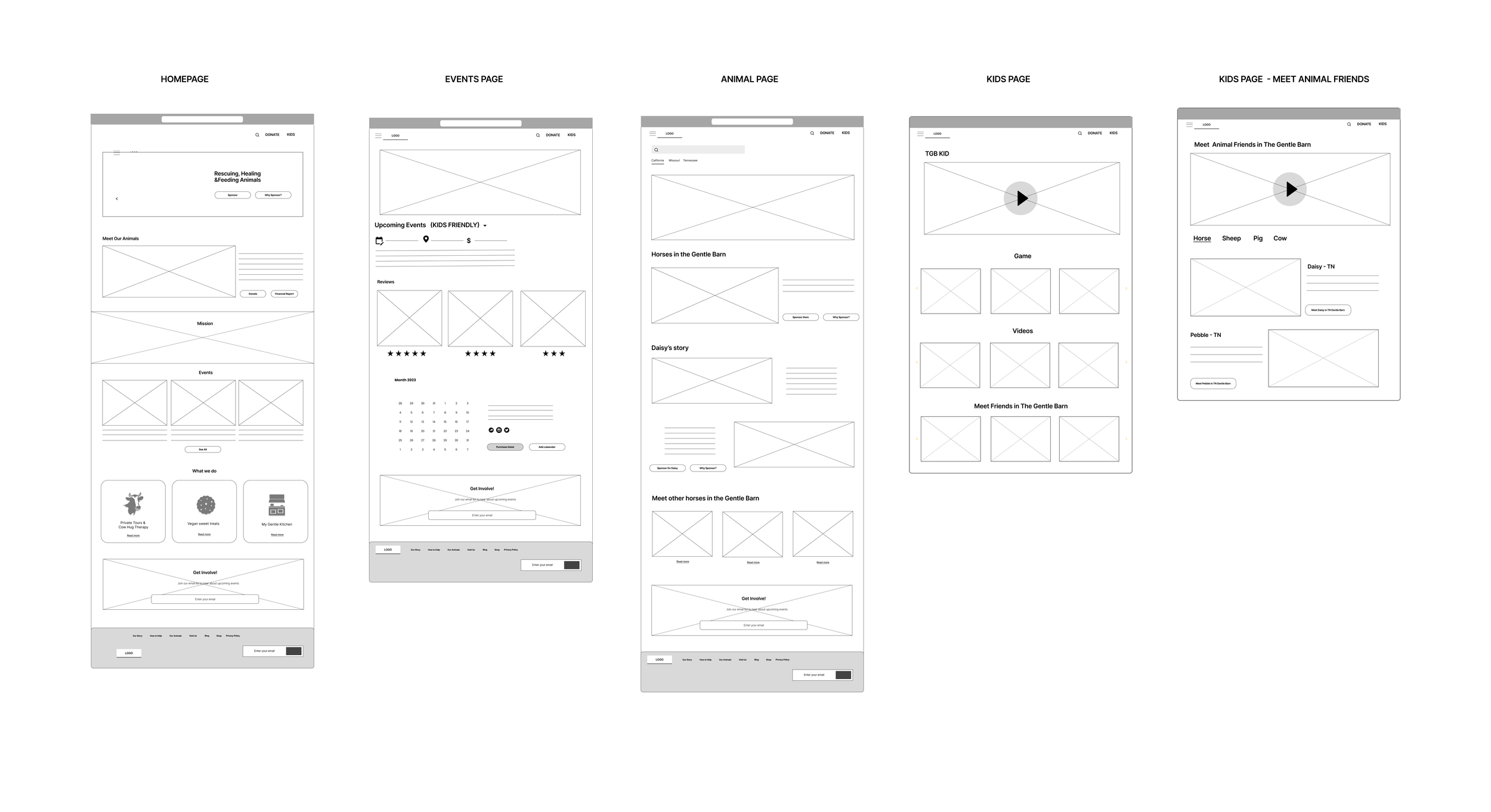
REVISED LO-FI WIREFRAMES
STYLE GUIDE
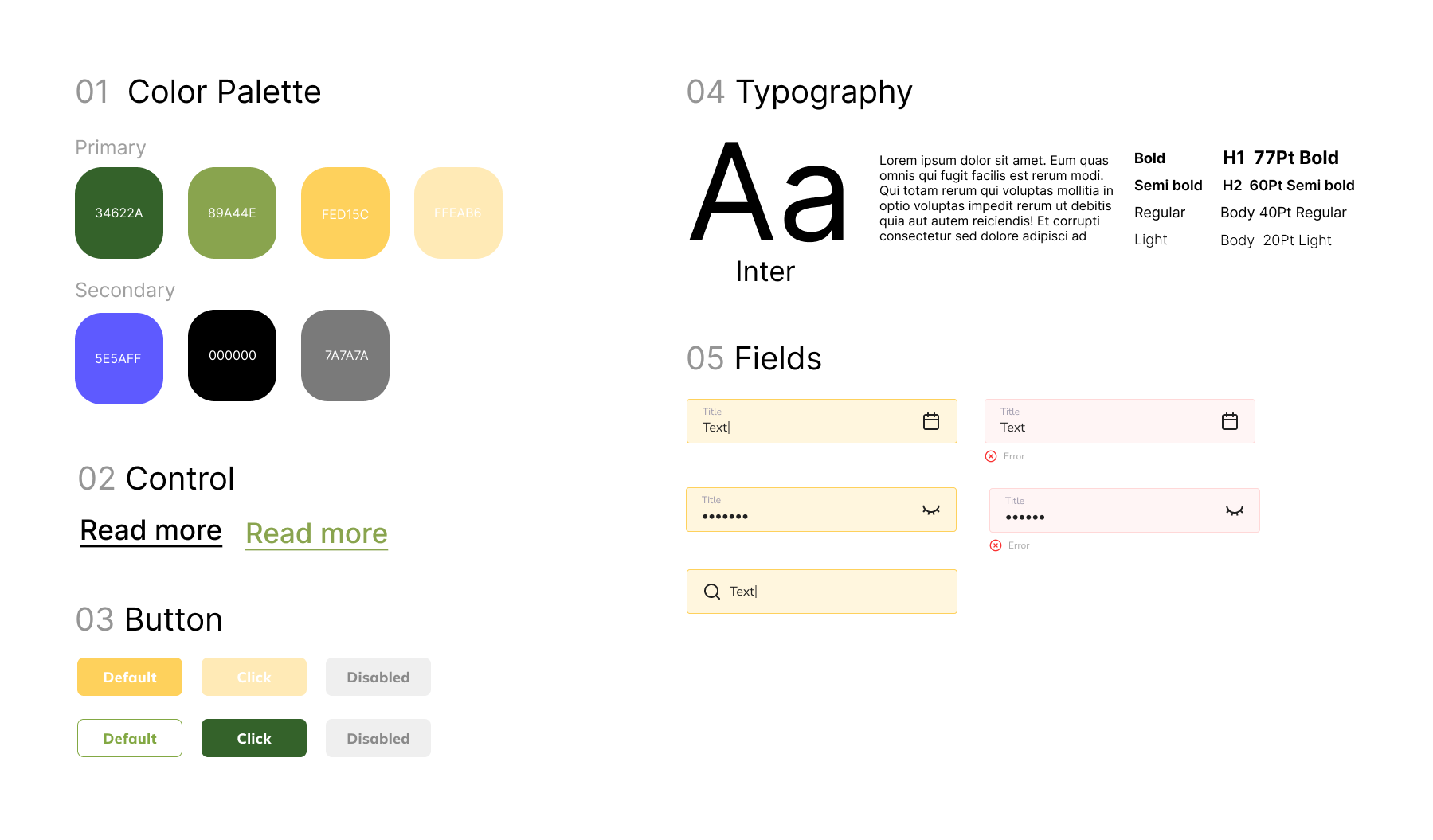
The current color palette used by The Gentle Barn does not pass the WCAG guideline for color contrast. However, the inconsistent design throughout also adds to the unpleasant experience for their users. Thus, I re-created a style guideline considered accessibility and readability.
WHAT WE DID ..
(1) Add a hamburger navigation to simplified top-level navigations
(2) Use Family imagery to provide users a glance
(3) Add a search bar helps users to find a desirable contents
(4) Add mission statement to make a clarification about The Gentle Barn’s purpose
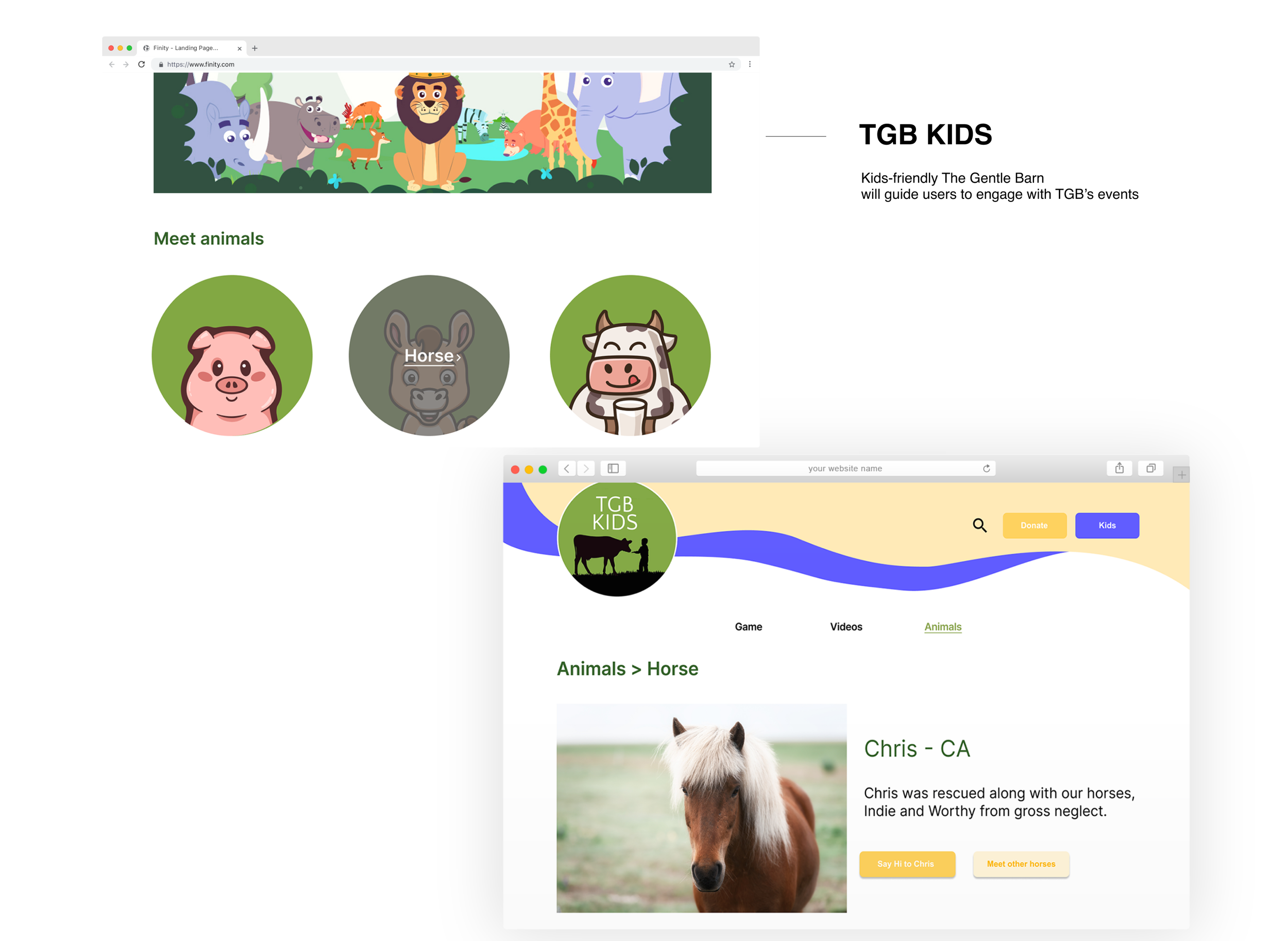
(1) Add ” Say Hi to Chris” and “Meet other horses” for users to easily engage with TGB events
(2) Create animal illustrations to catch users attention.
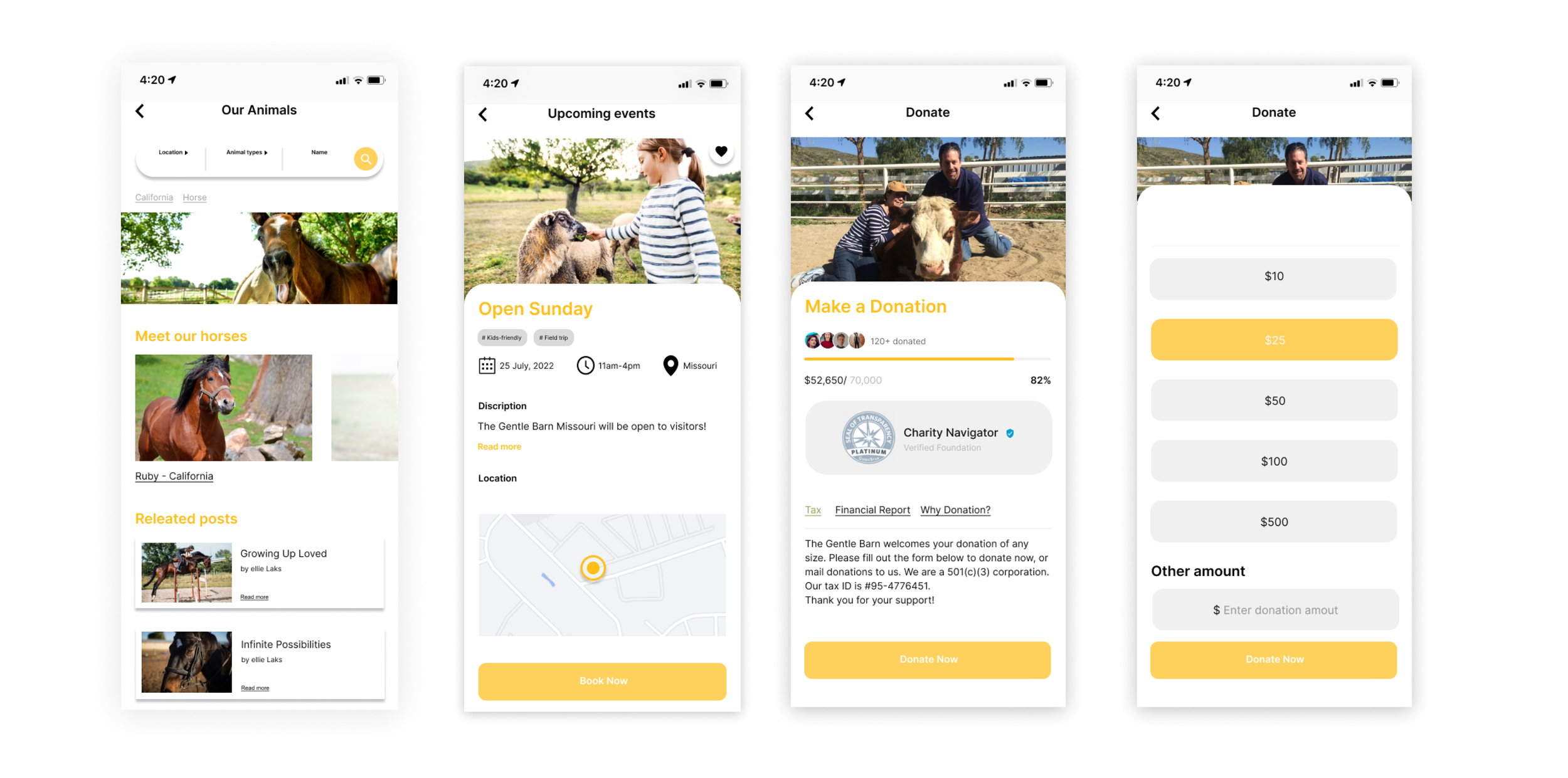
(1) Add a search bar to find desired contents quickly
(2) Users can understand event’s information and reserve it without going through multiple steps
(3) Verified mark and Financial report preserve the trust
(4) Suggesting donation amount are opportunities for users to nudge their amount of donation
Next Steps
I believe there are still more works that could be done through follow-up usability studies. Due to the time constraints , we couldn’t commit time to develop Kids page and its usability tests for proper target audiences. We learned that we could address users' concerns regarding organization transparency with thoughtful navigation and clear presentation of information. Designwise,I still think there are rooms for improvement. Next time I would iterate as much as I can.